


klette® – is a russian chamber brand of care cosmetics, inspired by the beauty of mountains and their power, based on the idea that the customer turns to the brand to solve his skin problem or maintain its condition, being at the foot of the mountain, and, using professional care products, reaches the top thanks to quality cosmetics;
klette's philosophy is to help overcome skin challenges, reach the top and find harmony with oneself.


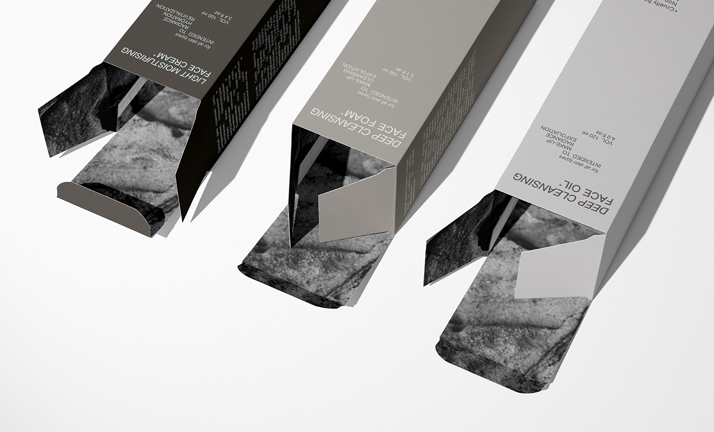
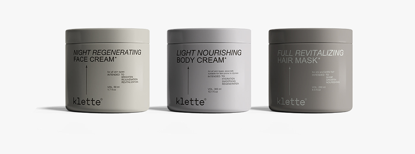
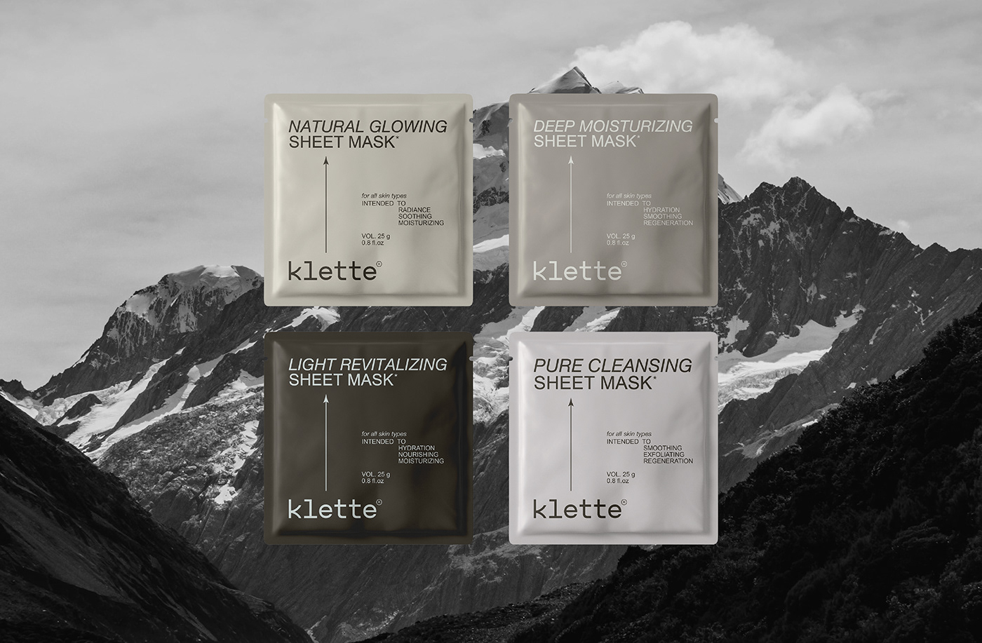
The branded color palette has been chosen to connect with mountain landscapes and rocks: calm gray and near-beige shades. The accent is a subtle pastel lilac, which refers the beholder to the lavender fields near the mountain valleys, and the celestial shade of the main text on the darkest package hides the relationship with the vast sky, emphasizing the beauty of the mountains.
The first lines of each product name are in italic, as if to symbolize the mountainside.


The branded text element, which can be traced throughout the packaging and media – «INTENDED TO...» is also made in the form of a mountain silhouette: the purpose of the product is built «step by step» from the main action of the care product to the subsequent ones, and draws a kind of ascent, climbing to the top of the mountain,
and the arrow stretching from the logo to the product name on almost all layouts is a kind of visual guide for the consumer, pointing the way and telling them that this product will help them climb up, achieve the desired result and be at the top.


Essentially, the arrow is a metaphor for elevation, saying that with a certain klette product, you can reach the pinnacle of skincare for any skin type. It also creates a sense of movement and direction, which helps to grab the consumer's attention and make them want to experience the product and achieve the results the brand offers.

The logo includes a combination of sharp and geometric shapes resembling the shape of mountains and referring to facial features. Thus, the curves of the letter «k» resemble the top of a mountain, «l» has a peculiar shape of a nose.
The font of the logo is hand-drawn and close to the classic one, which gives it firmness. This design symbolizes the beauty and harmony of nature, as well as power and resilience, which is a perfect reflection of the brand's values. With its simplicity and stylish execution, this logo will be easily recognizable and will attract the attention of consumers.

The abbreviated version of the logo (not mandatory), which can be noticed on some individual layouts, is made of the joined letters «K» and is a kind of image of a silhouette of mountains, symbolizing power and steadfastness.


I'm open to commissions and would be happy to develop
meaningful design for your brand
Contacts ↓
[INSTAGRAM] [TELEGRAM] [BEHANCE]
meaningful design for your brand
Contacts ↓
[INSTAGRAM] [TELEGRAM] [BEHANCE]


